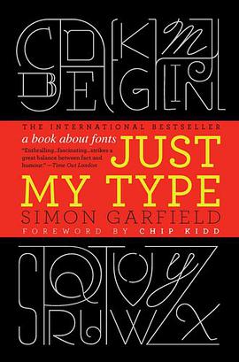
Just My Type
内容简介
A hugely entertaining and revealing guide to the history of type that asks, What does your favorite font say about you?
Fonts surround us every day, on street signs and buildings, on movie posters and books, and on just about every product we buy. But where do fonts come from, and why do we need so many? Who is responsible for the staid practicality of Times New Roman, the cool anonymity of Arial, or the irritating levity of Comic Sans (and the movement to ban it)?
Typefaces are now 560 years old, but we barely knew their names until about twenty years ago when the pull-down font menus on our first computers made us all the gods of type. Beginning in the early days of Gutenberg and ending with the most adventurous digital fonts, Simon Garfield explores the rich history and subtle powers of type. He goes on to investigate a range of modern mysteries, including how Helvetica took over the world, what inspires the seeming ubiquitous use of Trajan on bad movie posters, and exactly why the all-type cover of Men are from Mars, Women are from Venus was so effective. It also examines why the "T" in the Beatles logo is longer than the other letters and how Gotham helped Barack Obama into the White House. A must-have book for the design conscious, Just My Type's cheeky irreverence will also charm everyone who loved Eats, Shoots & Leaves and Schott's Original Miscellany.
......(更多)
作者简介
Simon Garfield is the author of twelve acclaimed books of nonfiction. He lives in London and St. Ives, Cornwall, and currently has a soft spot for Requiem Fine Roman and HT Gelateria.
Chip Kidd is associate art director for Alfred A. Knopf, where his jacket designs have revolutionized the art of American book packaging. He is the author of numerous books, including The Cheese Monkeys.
......(更多)
目录
Foreword Chip Kidd xii
Introduction: Love Letters 1
Periodic Table of Typefaces 6-7
1 We don't serve your type 9
2 Capital Offence 22
Gill Sans 41
3 Legibility vs Readability 45
Albertus 62
4 Can a font make me popular? 65
Futura v Verdana 73
5 The Hands of Unlettered Men 77
Doves 84
6 The Ampersand's Final Twist 89
7 Baskerville is Dead (Long Live Baskerville) 97
Mrs Eaves & Mr Eaves 106
8 Tunnel Visions 109
9 What is it about the Swiss? 124
Frutiger 139
10 Road Akzidenz 143
11 DIY 158
12 What the Font? 172
13 Can a font be German, or Jewish? 180
Futura 193
14 American Scottish 196
Moderns, Egyptians and Fat Faces 204
15 Gotham is Go 208
16 Pirates and Clones 220
Optima 233
17 The Clamour from the Past 235
Sabon 251
18 Breaking the Rules 254
The Interrobang 268
19 The Serif of Liverpool 270
Vendôme 284
20 Fox, Gloves 286
21 The Worst Fonts in the World 296
22 Just My Type 313
Bibliography 333
Online 337
Acknowledgements 339
Font and image credits 343
Index 345
......(更多)
读书文摘
必须能让驾驶员看到标识后及时做出反应,重要的是辨识单词而非让驾驶员去一个个阅读字母。乔克说就好像修拉的点画。而我则总把它们和阿姆斯特丹的伦勃朗肖像做类比:如果你凑近观察,细节都毫无意义,但是在恰当的阅读距离上,一切就都变得很明了了
Typefaces are now 560 years old.
......(更多)


