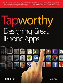
Tapworthy
内容简介
So you've got an idea for an iPhone app -- along with everyone else on the planet. Set your app apart with elegant design, efficient usability, and a healthy dose of personality. This accessible, well-written guide shows you how to design exceptional user experiences for the iPhone and iPod Touch through practical principles and a rich collection of visual examples.
......(更多)
作者简介
Josh Clark is a writer, designer, and developer who helps creative people clear technical hassles to share their ideas with the world. As speaker and consultant, he has helped scores of companies build effective websites and mobile apps. When he's not writing or speaking about clever design and humane software, he's building it. Josh is the creator of Big Medium, friendly software that actually makes it fun to manage a website. He's also the author of Best iPhone Apps and iWork '09: The Missing Manual, both published by O'Reilly. Before the rise of the Web, Josh worked on a slew of national PBS programs at WGBH-TV in Boston. He shared his three words of Russian with Mikhail Gorbachev, strolled the ranch with Nancy Reagan, hobnobbed with Rockefellers, and wrote trivia questions for a primetime game show. Now Josh makes words and spins code at his hypertext laboratory globalmoxie.com. He divides his time between Providence, Rhode Island, and Paris, France.
......(更多)
目录
Chapter 1 Touch and Go
On the Go: One Hand, One Eye, One Big Blur
Get It Done Quick
One Tool in a Crowded Toolbox
Bored, Fickle, and Disloyal
Double-Tap, Pinch, Twist, What?
Clumsy Fingers
So, What, Do I Design for Dummies?
Chapter 2 Is It Tapworthy?
There's Not an App for That
What's Your Story?
What Makes Your App Mobile?
First Person: Josh Williams and Gowalla
Big Talent for Little Icons
Get to Pixels Fast
Making It Work
Try, Try Again
Finding Focus
Optimizing for the Primary Task
Building for Exploration
Colorful Personality
Less Flash, More Function
The App Doesn't Have to Do It All
Mobile Mindsets
"I'm Microtasking"
"I'm Local"
"I'm Bored"
What Makes You So Special Anyway?
Wait, Wait, Come Back!
Throw Out the Babies, Too
Can't I Get That on the Web?
Touchpoints
Chapter 3 Tiny Touchscreen
A Physical Feel
Rule of Thumb
The Magic Number Is 44
Don't Crowd Me
First Person: James Thomson and PCalc
Designing for Touch
Give Me Feedback
Pimp My Calculator: Virtual Keypads
Pointed Design
Take It From the Top
Design to a 44-Pixel Rhythm
Be a Scroll Skeptic
Edit, Edit, Edit
Secret Panels and Hidden Doors
Touchpoints
First Person: Rusty Mitchell and USA Today
All the News That Fits
Psst . . . Hints for Working Custom Controls
Big Problem with Tiny Buttons
Either/Or: You Can't Fit It All
Chapter 4 Get Organized
WWJD: What Would Jobs Do?
Getting Around: Apple's Navigation Models
Flat Pages: A Deck of Cards (or Just One)
Tab Bar: What's on the Menu?
Tree Structure: Let 1,000 Screens Bloom
Combining Navigation Models
Modal Views and Navigational Cul-de-Sacs
A Tangled Web
Storyboarding Your App on Paper
Put Something Ugly on Your iPhone
Touchpoints
First Person: Jürgen Schweizer and Things
Organizing the App
Choosing the Navigation Style
Minimal Graphics
What Makes the Feature List?
Rhyme with Apple's Design Language
Chapter 5 The Standard Controls
The Power of Standard Visuals
The Navigation Bar Shows the Way
The Toolbar
"So an Icon Goes into a Bar . . ."
The Search Bar
Table Views Are Lists on Steroids
Setting the Table: Indexes and Grouped Lists
Table View Editing Tools
Text Me
Editing Text
Fixing Typoz
Is That for Here or to Go?
Don't Make 'Em Keybored
Multiple Choice: Pickers, Lists, and Action Sheets
On the Button
Yes and No: Switches
Segmented Controls Are Radio Buttons
Sliders Stay on Track
Settings: A Matter of Preference
Is There More?
Touchpoints
Chapter 6 Stand Out
What's Your App's Personality?
Gussying Up Familiar Pixels
You Stay Classy
Keep It Real
Designing Custom Toolbar Icons
Metaphorically Speaking
I Call My New Invention "The Wheel"
And Now for Something Completely Different
Touchpoints
First Person: Craig Hockenberry, Gedeon Maheux, and Twitterrific
Taming a Dense Thicket of Options
Asterisk = Action
Color Me Unique
Testing the Bare Bones
Chapter 7 First Impressions
Your Icon Is Your Business Card
Building Your App's Icons
What's In a Name?
While You Wait: The Launch Image
The Illusion of Suspended Animation
Put Out the Welcome Mat
Instructions Can't Make You Super
The First Screen
Touchpoints
First Person: Joe Hewitt and Facebook
More Than a Lite Version
A Collection of "Sub-Apps"
Physics According to Apple
Easy on the Chrome
The Trouble with Notifications
Chapter 8 Swipe! Pinch! Flick!
Finding What You Can't See
Pave the Cowpaths
Shortcuts and Backup Plans
Piggybacking Standard Gestures
Shake, Shake, Shake
Two's a Crowd
Awkwardness for Self Defense
Phone Physics
Touchpoints
Chapter 9 Know the Landscape
Why Do People Flip?
A Whole New Landscape
Making a Complicated Turn
Don't Lose Your Place
Touchpoints
Chapter 10 Polite Conversation
When To Interrupt
Remain Calm and Carry On
Pushy Notifications
No Stinkin' Badges
Yep, I'm Working on It
Bending Time: Progress Bars and Other Distractions
Touchpoints
Chapter 11 Howdy, Neighbor
Public Square: Contacts, Photos, and Events
Tag, You're It: Passing Control to Other Apps
Roll Your Own: Browsers, Maps, and Email
Happy Trails, Neighbor
Touchpoints
......(更多)
读书文摘
不要弹出来让用户到App Store里打分。有些应用偶尔会弹出一个警告框,让用户去App Store里给应用打分。大家都是出来混饭吃的,你这样打断我,然后让我去帮你写点好评,不仁不义啊。只关注在用户目标和任务上,而不是关注你自己。如果要让大家到App Store打分,那就在应用设置里"关于我们"的页面里加上链接吧
......(更多)


